Text-to-causal-loop?

Automating System Dynamics with AI
System Dynamics (SD) modelling is the most powerful tool you've never heard of. To explain why, I'll borrow Greg Hennessy's comparison to spreadsheets:
spreadsheet: D22 = AF15 × Q8
system dynamics: Revenue = Price × Quantity
Which one is more legible?
Spreadsheets hide causal relationships behind numeric inputs and formulas; SD models define them explicitly by illustrating their structure, and letting numerical integration do the rest.
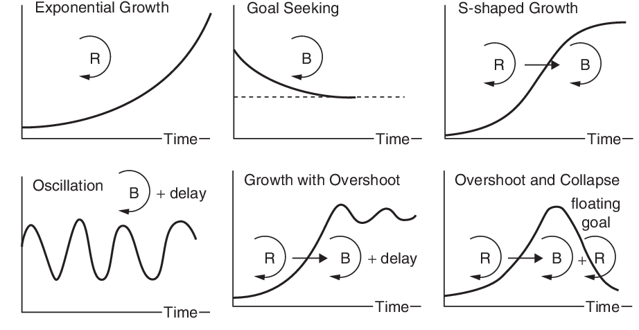
Spreadsheets are great at telling you the value of y at time x. But SD tells you the shape of the curve!
The Problem
SD has a steep technical learning curve. Check out:
- Ted Pavlic's 24 part lecture series SOS 212: Systems, Dyanmics and Sustainability
- State-of-the-art model En-ROADS Climate Solutions Simulator and the accompanying reference guide.
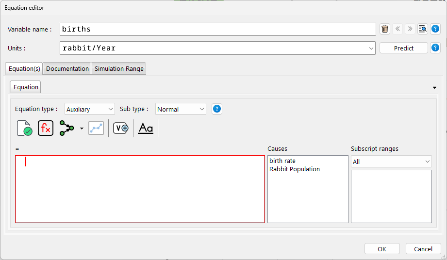
SD has dreadful software. Here's a scary screenshot of VENSIM 😬
Solution
Automate it!
Imagine typing a few sentences about any real world scenario and BOOM! a diagram appears instantly describing the causal connections between all relevant elements described in your sentence.
To System Dynamics scholars this may sound too good to be true because:
- Models help clarify one's own thinking.
- Causal loop diagrams are the starting point for stock and flow diagrams.
The Causal Loop Diagram
System Dynamics models are commonly illustrated as "causal loop diagrams". By convention, they are represented as directed graphs with edges labelled by a polarity (+ / - ) that denotes a possible causal relationship between two vertices. This relationship expresses an increase (or decrease) of one variable in its effect on the other, relative to what it would otherwise have been.
At a glance you can ignore the individual variables, and just pay attention to the larger "loops". These loops are sometimes labelled "balancing" or "reinforcing" to illustrate where feedback is occurring.
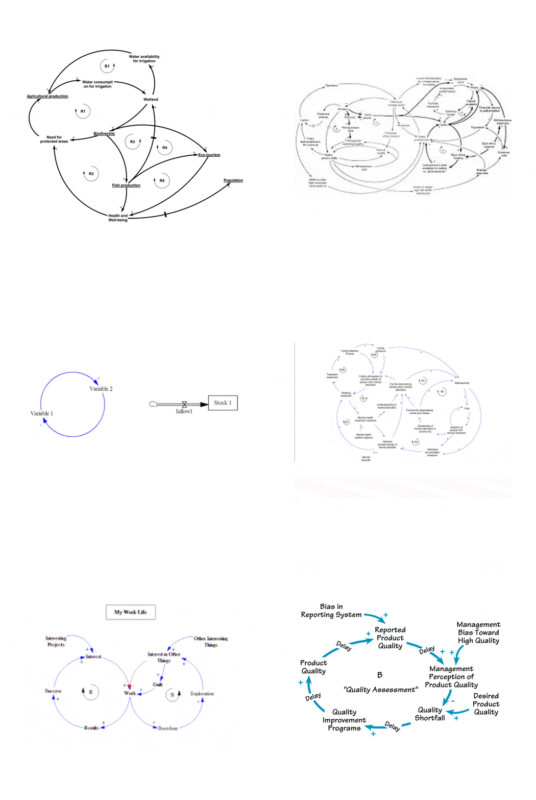
Since thousands of causal loop diagrams share the same visual convention (labels connected by edges with polarity)—they are ideal candidates for the creation of a training data set; examples used during a supervised learning algorithm to classify or predict new, unknown data.
Parsing diagrams
How to transform these images into graph notation? A procedural, OpenCV pipeline could detect arrows, lines and text before parsing the data into graph notation (networkx).
Alternatively, a vision transformer or CNN could work; this library created by students could be a good start.

LLaVA 1.6 is now sufficient for end-to-end parsing of images of causal loops to graph notation.
Augmenting Data with GPT-3
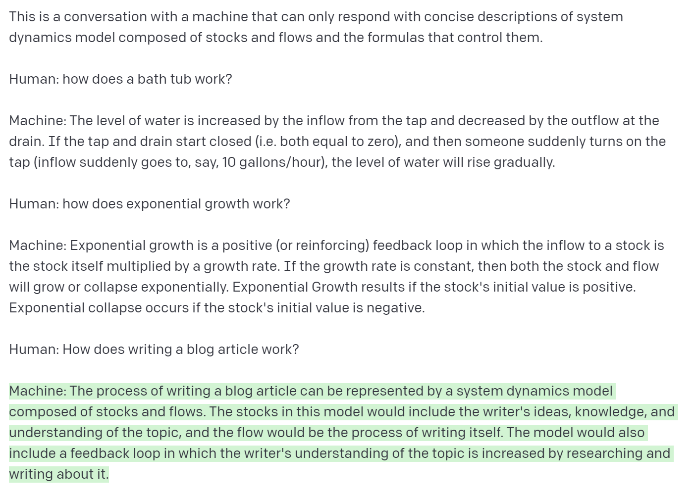
The resulting graph data can then be augmented by generating additional, synthetic labels (lexical substitution) with few-shot learning using GPT3. From relatively small data sets, "prompt engineering" comes in handy here:
Graph embeddings and link prediction
The sentence/word embeddings obtained by large language models could be used as features in our graph link prediction model.
Regression analysis with XGBOOST
Perhaps embeddings could become features able to be “stacked” to create deep features
"Stacking results in features that are more expressive than individual primitives themselves. This enables the automatic creation of complex patterns for machine learning" (Featuretools)
